From question to answer: Stratification and outcome models

Overview

The first five chapters built the scaffolding: potential outcomes, counterfactuals, DAGs, and the argument that statistics alone cannot resolve causal questions. This chapter is where estimation starts. It works through three approaches in order of increasing generality: stratification, parametric outcome models, and a survey of other estimators, showing what each requires and what it gives back.

6.1 Causal inference with group_by() and summarise()

Single binary confounder

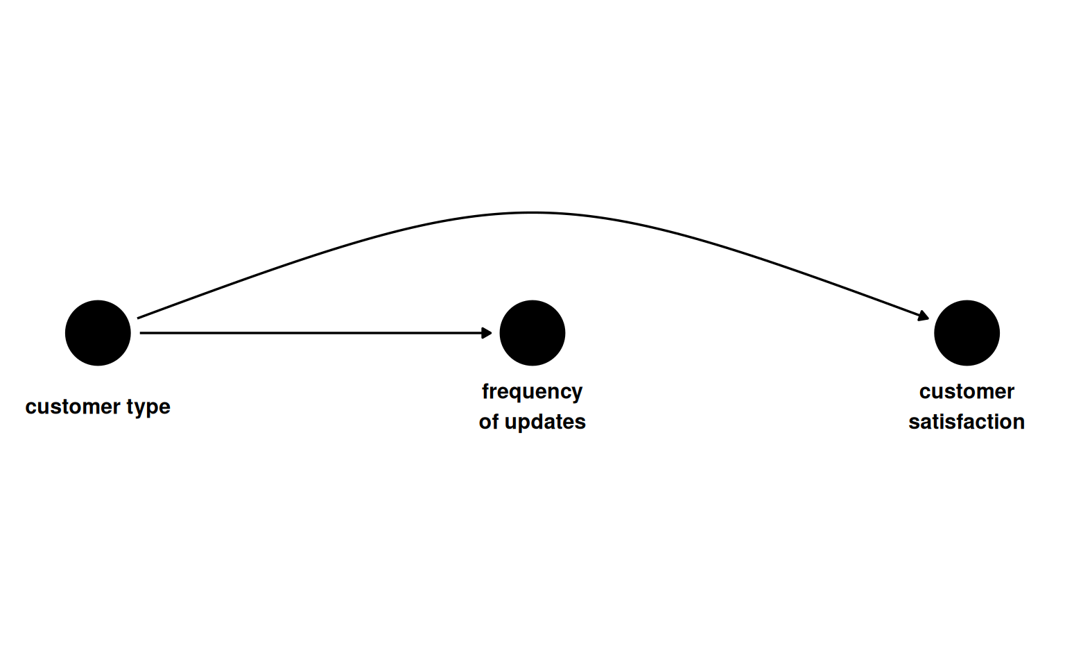
The running example is a software company trying to measure whether update frequency (weekly vs. daily) affects customer satisfaction, scored as a standardised value with population mean 0 and standard deviation 1. The exposure is not randomised. Customer type (free or premium) causes both update frequency and satisfaction, opening a backdoor path. The DAG has no arrow from updates to satisfaction because the true effect is zero.

Show code
coords1 <- list(
  x = c(customer_type = 1, updates = 2, satisfaction = 3),
  y = c(customer_type = 0, updates = 0, satisfaction = 0)
)


dagify(
  satisfaction ~ customer_type,
  updates ~ customer_type,
  coords = coords1,
  labels = c(
    customer_type = "customer type",
    updates = "frequency\nof updates",
    satisfaction = "customer\nsatisfaction"
  )
) |>
  ggdag(use_text = FALSE, use_edges = FALSE) +
  geom_dag_text(
    aes(label = label),
    nudge_y = c(-.05, -.05, -.05),
    color = "black"
  ) +
  geom_dag_edges_arc(curvature = c(0.07, 0)) +
  theme_dag() +
  ylim(c(.2, -.2))
Figure 7.1: Update frequency and satisfaction share a common cause. No direct causal arrow connects them.

The simulation sets the true average treatment effect to zero. Each unit’s potential outcome under daily updates equals its potential outcome under weekly updates.

Show code
satisfaction1 <- tibble(
  customer_type = rbinom(n, 1, 0.5),
  p_exposure = case_when(
    customer_type == 1 ~ 0.75,
    customer_type == 0 ~ 0.25
  ),
  update_frequency = rbinom(n, 1, p_exposure),
  y0 = customer_type + rnorm(n),
  y1 = y0,
  satisfaction = (1 - update_frequency) * y0 + update_frequency * y1,
  observed_potential_outcome = case_when(
    update_frequency == 0 ~ "y0",
    update_frequency == 1 ~ "y1"
  )
) |>
  mutate(
    satisfaction = as.numeric(scale(satisfaction)),
    update_frequency = factor(update_frequency, labels = c("weekly", "daily")),
    customer_type = factor(customer_type, labels = c("free", "premium"))
  )

Comparing the exposure groups without accounting for customer type produces a spurious gap. Premium customers both receive daily updates more often and are more satisfied, so the raw comparison picks up the confounder as if it were a treatment effect.

Show code
satisfaction1 |>
  summarise(avg_satisfaction = round(mean(satisfaction), 3), .by = update_frequency) |>
  kbl(
    col.names = c("Update frequency", "Mean satisfaction"),
    align = "lc"
  ) |>
  kable_styling(
    bootstrap_options = c("striped", "hover", "condensed"),
    full_width = FALSE
  ) |>
  column_spec(1, bold = TRUE)
Table 7.1: Unadjusted mean satisfaction by update frequency. The 0.47-point gap is confounding, not causation.
Update frequency Mean satisfaction
weekly -0.237
daily 0.238

Stratifying by customer type restores conditional exchangeability. Within free customers and within premium customers, the daily and weekly groups are comparable and the difference collapses.

Show code
satisfaction_strat <- satisfaction1 |>
  summarise(
    avg_satisfaction = round(mean(satisfaction), 3),
    .by = c(customer_type, update_frequency)
  )

satisfaction_strat |>
  kbl(
    col.names = c("Customer type", "Update frequency", "Mean satisfaction"),
    align = "llc"
  ) |>
  kable_styling(
    bootstrap_options = c("striped", "hover", "condensed"),
    full_width = FALSE
  ) |>
  collapse_rows(columns = 1, valign = "top") |>
  column_spec(1:2, bold = TRUE)
Table 7.2: Mean satisfaction stratified by customer type and update frequency. Within each stratum the groups are exchangeable.
Customer type Update frequency Mean satisfaction
free weekly -0.458
premium daily 0.463
weekly 0.452
free daily -0.433

Taking the mean of the stratum-specific differences gives an overall estimate close to the true value of zero.

Show code
satisfaction_strat |>
  pivot_wider(names_from = update_frequency, values_from = avg_satisfaction) |>
  reframe(estimate = daily - weekly) |>
  summarise(estimate = round(mean(estimate), 4)) |>
  kbl(col.names = "Overall estimate", align = "c") |>
  kable_styling(
    bootstrap_options = c("striped", "condensed"),
    full_width = FALSE
  ) |>
  row_spec(0, bold = TRUE)
Table 7.3: Overall stratified estimate, averaging stratum-specific differences.
Overall estimate
0.018

Two binary confounders

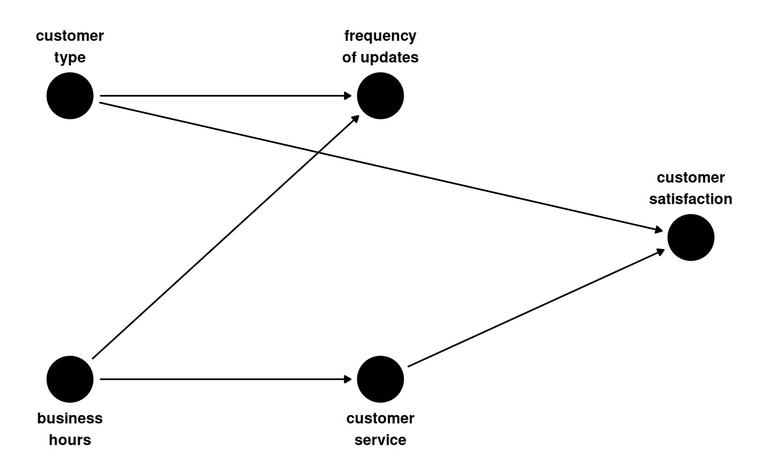
A second confounder enters: whether the update occurs within business hours. Weekly updates fall within business hours more often; customers whose working hours overlap with the company’s support window have higher satisfaction through better access to customer service. There are now two valid adjustment sets: {customer_type, business_hours} and {customer_type, customer_service}.

Show code
dagify(
  satisfaction ~ customer_service + customer_type,
  customer_service ~ business_hours,
  updates ~ customer_type + business_hours,
  coords = time_ordered_coords(),
  labels = c(
    customer_type = "customer\ntype",
    business_hours = "business\nhours",
    updates = "frequency\nof updates",
    customer_service = "customer\nservice",
    satisfaction = "customer\nsatisfaction"
  )
) |>
  ggdag(use_text = FALSE) +
  geom_dag_text(
    aes(label = label),
    nudge_y = c(-.35, -.35, .35, .35, .35),
    color = "black"
  ) +
  theme_dag()
Figure 7.2: Two confounders. Business hours affects both update frequency and satisfaction through customer service availability.
Show code
satisfaction2 <- tibble(
  customer_type = rbinom(n, 1, 0.5),
  business_hours = rbinom(n, 1, 0.5),
  p_exposure = case_when(
    customer_type == 1 & business_hours == 1 ~ 0.75,
    customer_type == 0 & business_hours == 1 ~ 0.9,
    customer_type == 1 & business_hours == 0 ~ 0.2,
    customer_type == 0 & business_hours == 0 ~ 0.1
  ),
  update_frequency = rbinom(n, 1, p_exposure),
  customer_service_prob = business_hours * 0.9 + (1 - business_hours) * 0.2,
  customer_service = rbinom(n, 1, prob = customer_service_prob),
  satisfaction = 70 + 10 * customer_type + 15 * customer_service + rnorm(n)
) |>
  mutate(
    satisfaction = as.numeric(scale(satisfaction)),
    customer_type = factor(customer_type, labels = c("free", "premium")),
    business_hours = factor(business_hours, labels = c("no", "yes")),
    update_frequency = factor(update_frequency, labels = c("weekly", "daily")),
    customer_service = factor(customer_service, labels = c("no", "yes"))
  )

Both adjustment sets recover an effect near zero. The small difference between them reflects chance variation in which covariates were used.

Show code
est_bh <- satisfaction2 |>
  summarise(
    avg_satisfaction = mean(satisfaction),
    .by = c(customer_type, business_hours, update_frequency)
  ) |>
  pivot_wider(names_from = update_frequency, values_from = avg_satisfaction) |>
  summarise(estimate = round(mean(daily - weekly), 5))

est_cs <- satisfaction2 |>
  summarise(
    avg_satisfaction = mean(satisfaction),
    .by = c(customer_type, customer_service, update_frequency)
  ) |>
  pivot_wider(names_from = update_frequency, values_from = avg_satisfaction) |>
  summarise(estimate = round(mean(daily - weekly), 5))

tibble(
  `Adjustment set` = c(
    "{customer_type, business_hours}",
    "{customer_type, customer_service}"
  ),
  Estimate = c(est_bh$estimate, est_cs$estimate)
) |>
  kbl(align = "lc") |>
  kable_styling(
    bootstrap_options = c("striped", "hover", "condensed"),
    full_width = FALSE
  ) |>
  column_spec(1, bold = TRUE, monospace = TRUE)
Table 7.4: Stratified estimates under two valid adjustment sets. Both are close to the true effect of zero.
Adjustment set Estimate
{customer_type, business_hours} -0.00415
{customer_type, customer_service} -0.00196

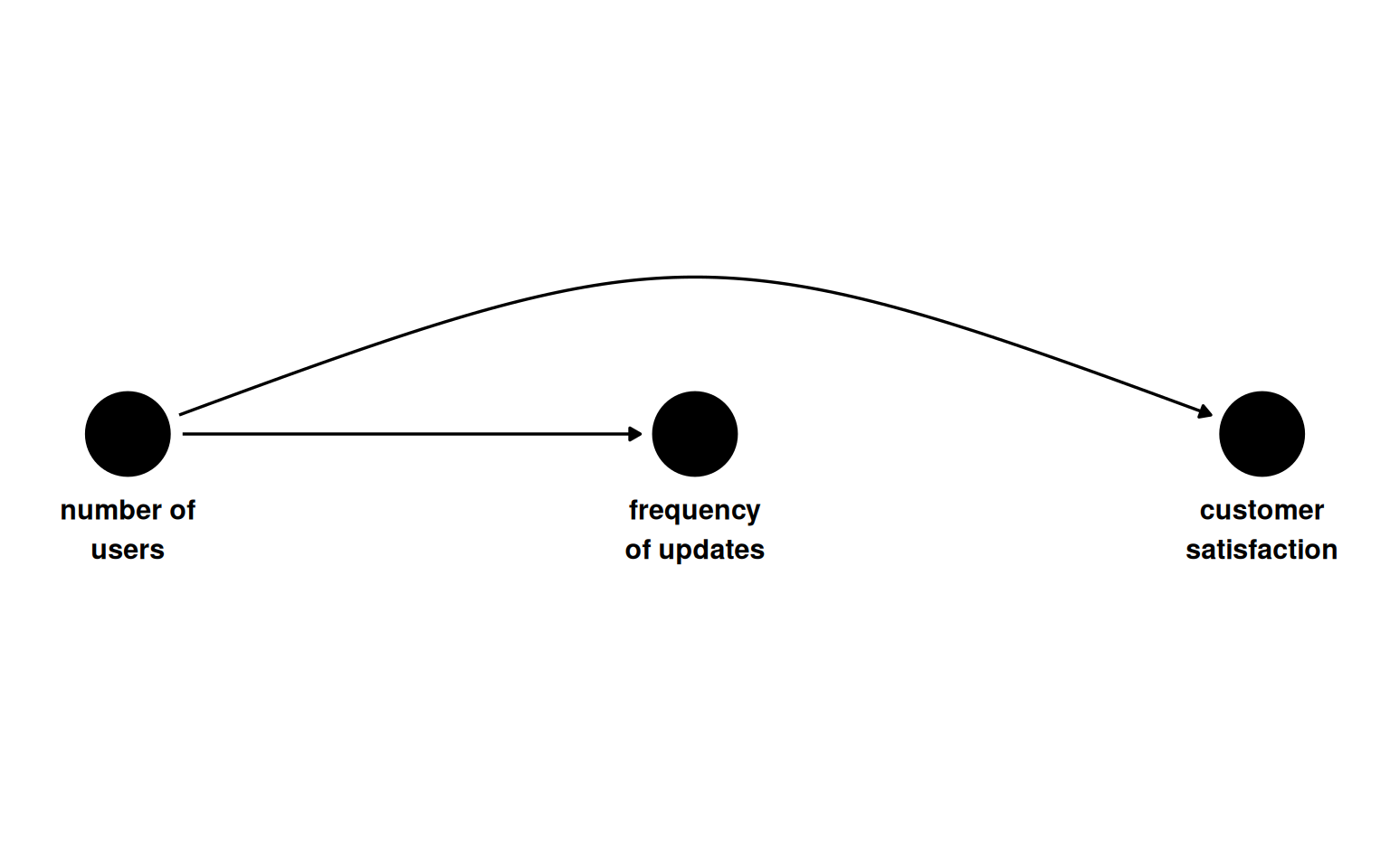
Continuous confounder and the curse of dimensionality

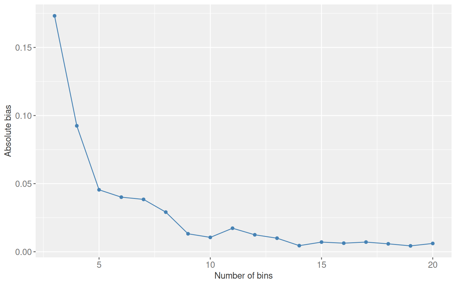
With a continuous confounder (number of users per organisation), stratification requires binning. Coarser bins leave residual confounding. Finer bins eventually produce strata with nobody in one exposure arm, a stochastic positivity violation.

Show code
coords3 <- list(
  x = c(num_users = 1, updates = 2, satisfaction = 3),
  y = c(num_users = 0, updates = 0, satisfaction = 0)
)

dagify(
  satisfaction ~ num_users,
  updates ~ num_users,
  coords = coords3,
  labels = c(
    num_users = "number of\nusers",
    updates = "frequency\nof updates",
    satisfaction = "customer\nsatisfaction"
  )
) |>
  ggdag(use_text = FALSE, use_edges = FALSE) +
  geom_dag_text(
    aes(label = label),
    nudge_y = c(-.05, -.05, -.05),
    color = "black"
  ) +
  geom_dag_edges_arc(curvature = c(0.07, 0)) +
  theme_dag() +
  ylim(c(.2, -.2))
Figure 7.3: A single continuous confounder: number of users per customer organisation.
Show code
satisfaction3 <- tibble(
  num_users = runif(n, min = 1, max = 500),
  update_frequency = rbinom(n, 1, plogis(num_users / 100)),
  satisfaction = 70 + -0.2 * num_users + rnorm(n)
) |>
  mutate(
    satisfaction = as.numeric(scale(satisfaction)),
    update_frequency = factor(update_frequency, labels = c("weekly", "daily"))
  )

The plot below shows how absolute bias changes as bin count increases from 3 to 20. Bias falls consistently within this range. At 30 bins at least one cell becomes empty and the estimate is undefined.

Show code
update_bins <- function(bins) {
  satisfaction3 |>
    mutate(num_users_q = ntile(num_users, bins)) |>
    summarise(
      avg_satisfaction = mean(satisfaction),
      .by = c(num_users_q, update_frequency)
    ) |>
    pivot_wider(names_from = update_frequency, values_from = avg_satisfaction) |>
    summarise(bins = bins, estimate = mean(daily - weekly))
}

map(3:20, update_bins) |>
  list_rbind() |>
  ggplot(aes(x = bins, y = abs(estimate))) +
  geom_point(colour = ACCENT) +
  geom_line(colour = ACCENT) +
  labs(y = "Absolute bias", x = "Number of bins") +
  theme_gray(ink = INK, accent = ACCENT) +
  theme_sub_axis(text = element_text(size = 11))
Figure 7.4: Absolute bias as a function of bin count when stratifying on a continuous confounder. Bias falls as bins increase, but positivity violations appear around 30 bins with n = 10,000.
Show code
map(c(5, 20), update_bins) |>
  list_rbind() |>
  mutate(estimate = round(estimate, 5)) |>
  kbl(col.names = c("Bins", "Estimate"), align = "cc") |>
  kable_styling(
    bootstrap_options = c("striped", "hover", "condensed"),
    full_width = FALSE
  ) |>
  column_spec(1, bold = TRUE)
Table 7.5: Stratified estimates at 5 and 20 bins. More bins reduce residual confounding.
Bins Estimate
5 -0.04549
20 -0.00609

6.2 Parametric outcome models

Multivariable regression generalises stratification. The exposure and confounders enter together as predictors of the outcome. This is also called direct adjustment or regression adjustment. It handles continuous confounders without binning, at the cost of requiring the correct functional form.

For the two-confounder scenario, a linear model recovers an estimate near zero.

Show code
linear_reg() |>
  fit(
    satisfaction ~ update_frequency + customer_type + business_hours,
    data = satisfaction2
  ) |>
  tidy(conf.int = TRUE) |>
  filter(term == "update_frequencydaily") |>
  select(estimate, conf.low, conf.high) |>
  mutate(across(everything(), \(x) round(x, 4))) |>
  kbl(
    col.names = c("Estimate", "95% CI lower", "95% CI upper"),
    align = "ccc"
  ) |>
  kable_styling(
    bootstrap_options = c("striped", "hover", "condensed"),
    full_width = FALSE
  ) |>
  add_header_above(c("Effect of daily vs. weekly updates" = 3))
Table 7.6: Direct adjustment with two binary confounders. The confidence interval spans zero.
Effect of daily vs. weekly updates
Estimate 95% CI lower 95% CI upper
-0.0091 -0.0411 0.023

For the continuous confounder, no binning is needed.

Show code
linear_reg() |>
  fit(satisfaction ~ update_frequency + num_users, data = satisfaction3) |>
  tidy(conf.int = TRUE) |>
  filter(term == "update_frequencydaily") |>
  select(estimate, conf.low, conf.high) |>
  mutate(across(everything(), \(x) round(x, 5))) |>
  kbl(
    col.names = c("Estimate", "95% CI lower", "95% CI upper"),
    align = "ccc"
  ) |>
  kable_styling(
    bootstrap_options = c("striped", "hover", "condensed"),
    full_width = FALSE
  ) |>
  add_header_above(c("Effect of daily vs. weekly updates" = 3))
Table 7.7: Direct adjustment with a continuous confounder. The model extrapolates across the confounder space without requiring bins.
Effect of daily vs. weekly updates
Estimate 95% CI lower 95% CI upper
0.00153 -0.00059 0.00366

This works because the simulation is linear. When the true functional form is nonlinear, a standard lm() call produces biased estimates.

Functional form matters

When the confounder-outcome relationship is nonlinear, a linear model will give a biased causal estimate even with the correct confounder included. Two remedies: poly() if the true form is known, or natural cubic splines via splines::ns() when it is not.

Show code
set.seed(11)
satisfaction4 <- tibble(
  num_users = runif(n, 1, 500),
  update_frequency = rbinom(n, 1, plogis(num_users / 100)),
  satisfaction = 70 - 0.001 * (num_users - 300)^2 - 0.001 * (num_users - 300)^3
) |>
  mutate(
    satisfaction = as.numeric(scale(satisfaction)),
    update_frequency = factor(update_frequency, labels = c("weekly", "daily"))
  )

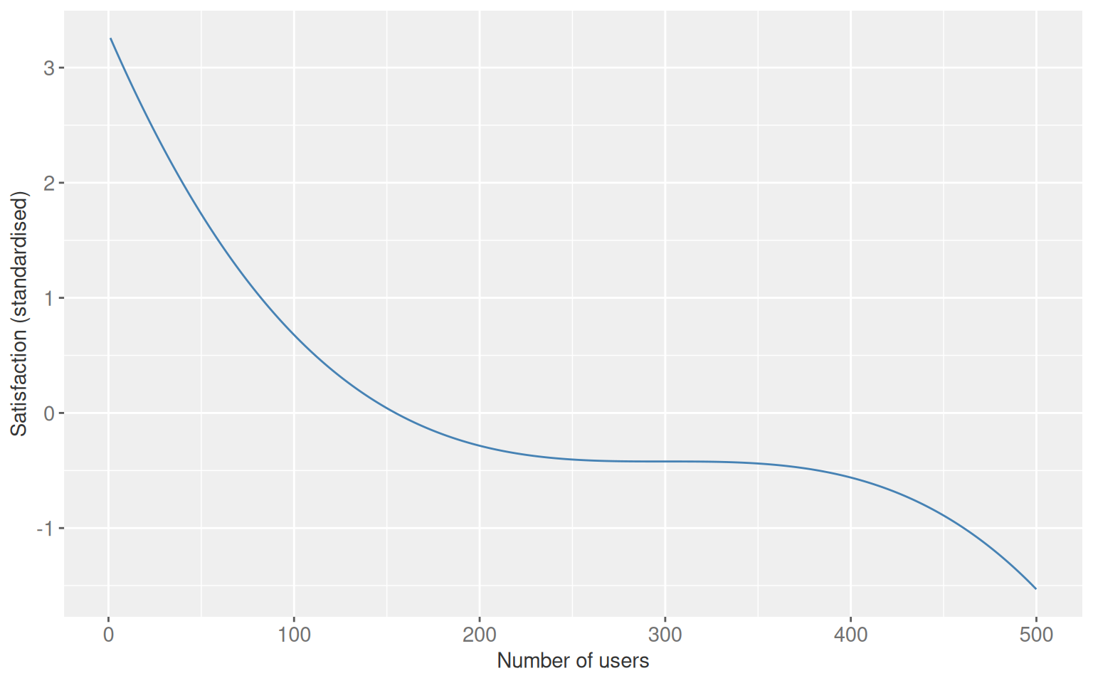
The nonlinear confounder-outcome relationship looks like this:

Show code
ggplot(satisfaction4, aes(x = num_users, y = satisfaction)) +
  geom_line(colour = ACCENT) +
  labs(x = "Number of users", y = "Satisfaction (standardised)") +
  theme_gray(ink = INK, accent = ACCENT) +
  theme_sub_axis(text = element_text(size = 11))
Figure 7.5: The nonlinear relationship between number of users and satisfaction used in the functional form comparison. A linear model cannot capture this shape.
Show code
fit_and_extract <- function(formula, data, label) {
  lm(formula, data = data) |>
    tidy(conf.int = TRUE) |>
    filter(term == "update_frequencydaily") |>
    select(estimate, conf.low, conf.high) |>
    mutate(model = label)
}

bind_rows(
  fit_and_extract(
    satisfaction ~ update_frequency + num_users,
    satisfaction4,
    "Linear (misspecified)"
  ),
  fit_and_extract(
    satisfaction ~ update_frequency + poly(num_users, 3),
    satisfaction4,
    "Polynomial degree 3 (correct form)"
  ),
  fit_and_extract(
    satisfaction ~ update_frequency + splines::ns(num_users, 3),
    satisfaction4,
    "Natural cubic spline"
  )
) |>
  select(model, estimate, conf.low, conf.high) |>
  mutate(across(where(is.numeric), \(x) round(x, 5))) |>
  kbl(
    col.names = c("Model", "Estimate", "95% CI lower", "95% CI upper"),
    align = "lccc"
  ) |>
  kable_styling(
    bootstrap_options = c("striped", "hover", "condensed"),
    full_width = FALSE
  ) |>
  row_spec(1, background = "#fff3cd") |>
  column_spec(1, bold = TRUE)
Table 7.8: Estimates under three model specifications when the true relationship is cubic. Only the correct polynomial and spline models recover a value near zero. The misspecified linear model is badly biased and the truth does not fall within its confidence interval.
Model Estimate 95% CI lower 95% CI upper
Linear (misspecified) -0.18879 -0.21889 -0.15869
Polynomial degree 3 (correct form) 0.00000 0.00000 0.00000
Natural cubic spline 0.00216 -0.00258 0.00690

Conditional vs. marginal effects

Direct adjustment gives a conditional effect: the estimated change in the outcome for a one-unit change in exposure, holding all other model variables fixed. Most causal questions target a marginal effect instead, the average effect across the distribution of covariates in the target population.

For continuous outcomes with a linear model and no interactions these two quantities are identical. Interactions break that equivalence. If the treatment effect varies by customer type, the single coefficient for update frequency no longer describes what happens across the whole population. Marginalization over the customer-type distribution is needed to answer the policy question. Conditional and marginal effects also diverge for non-collapsible link functions such as logistic and Cox regression, even without interactions.

6.3 Overview of estimators for causal inference

The rest of the book works through four families of unconfoundedness methods.

Show code
tibble(
  Method = c(
    "Inverse probability weighting",
    "Matching",
    "G-computation",
    "Doubly robust methods"
  ),
  `Also called` = c(
    "Propensity score weighting",
    "PS matching, distance matching",
    "Standardization, marginal effects",
    "TMLE, augmented propensity score"
  ),
  `Core idea` = c(
    "Reweight units by predicted treatment probability to create a pseudo-population where exchangeability holds. Extends to time-varying treatments.",
    "Pair treated and untreated units with similar propensity scores or covariate distances.",
    "Fit an outcome model, then marginalize predictions over the target population. Extends to time-varying treatments.",
    "Model both the outcome and the treatment. Consistent if either model is correctly specified. Permits machine learning for both."
  )
) |>
  kbl(align = "lll") |>
  kable_styling(
    bootstrap_options = c("striped", "hover", "condensed"),
    full_width = TRUE
  ) |>
  column_spec(1, bold = TRUE) |>
  column_spec(3, width = "50%")
Table 7.9: Unconfoundedness estimators covered in subsequent chapters.
Method Also called Core idea
Inverse probability weighting Propensity score weighting Reweight units by predicted treatment probability to create a pseudo-population where exchangeability holds. Extends to time-varying treatments.
Matching PS matching, distance matching Pair treated and untreated units with similar propensity scores or covariate distances.
G-computation Standardization, marginal effects Fit an outcome model, then marginalize predictions over the target population. Extends to time-varying treatments.
Doubly robust methods TMLE, augmented propensity score Model both the outcome and the treatment. Consistent if either model is correctly specified. Permits machine learning for both.

When exchangeability cannot be achieved, other identification strategies may apply.

Show code
tibble(
  Method = c(
    "Instrumental variables",
    "Regression discontinuity",
    "Difference-in-differences",
    "Synthetic controls"
  ),
  `Key assumption` = c(
    "An instrument affects treatment but not the outcome except through treatment.",
    "A threshold determines treatment; units just above and below it are comparable.",
    "Treated and untreated groups share parallel trends in the absence of treatment.",
    "A weighted combination of untreated units approximates the treated unit's counterfactual trajectory."
  )
) |>
  kbl(align = "ll") |>
  kable_styling(
    bootstrap_options = c("striped", "hover", "condensed"),
    full_width = TRUE
  ) |>
  column_spec(1, bold = TRUE) |>
  column_spec(2, width = "70%")
Table 7.10: Identification strategies for settings where exchangeability is implausible.
Method Key assumption
Instrumental variables An instrument affects treatment but not the outcome except through treatment.
Regression discontinuity A threshold determines treatment; units just above and below it are comparable.
Difference-in-differences Treated and untreated groups share parallel trends in the absence of treatment.
Synthetic controls A weighted combination of untreated units approximates the treated unit's counterfactual trajectory.

Causal methods in randomised trials

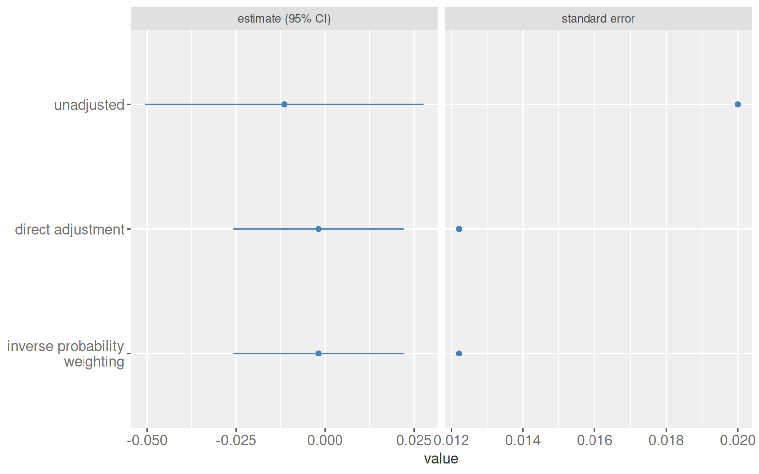
Randomisation removes confounding, so an unadjusted comparison is valid. Including pre-randomisation predictors of the outcome still helps: it reduces variance and narrows confidence intervals without introducing bias. It has been shown mathematically that propensity-score adjustment in a randomised trial always improves precision relative to the unadjusted estimate, at a level equivalent to what direct adjustment provides.

Show code
satisfaction_randomized <- tibble(
  customer_type = rbinom(n, 1, 0.5),
  business_hours = rbinom(n, 1, 0.5),
  update_frequency = rbinom(n, 1, 0.5),
  customer_service_prob = business_hours * 0.9 + (1 - business_hours) * 0.2,
  customer_service = rbinom(n, 1, prob = customer_service_prob),
  satisfaction = 70 + 10 * customer_type + 15 * customer_service + rnorm(n)
) |>
  mutate(
    satisfaction = as.numeric(scale(satisfaction)),
    customer_type = factor(customer_type, labels = c("free", "premium")),
    business_hours = factor(business_hours, labels = c("no", "yes")),
    update_frequency = factor(update_frequency, labels = c("weekly", "daily")),
    customer_service = factor(customer_service, labels = c("no", "yes"))
  )
Show code
extract_est <- function(model_df, label) {
  model_df |>
    mutate(term = if_else(term == "update_frequencydaily", "update_frequency", term)) |>
    filter(term == "update_frequency") |>
    mutate(model = label)
}

unadj <- lm(satisfaction ~ update_frequency, data = satisfaction_randomized) |>
  tidy(conf.int = TRUE) |>
  extract_est("unadjusted")

adj <- lm(
  satisfaction ~ update_frequency + business_hours + customer_type,
  data = satisfaction_randomized
) |>
  tidy(conf.int = TRUE) |>
  extract_est("direct adjustment")

df_psw <- satisfaction_randomized |>
  mutate(across(where(is.factor), as.integer)) |>
  mutate(update_frequency = update_frequency - 1) |>
  as.data.frame()

x <- PSW::psw(
  df_psw,
  "update_frequency ~ business_hours + customer_type",
  weight = "ATE",
  wt = TRUE,
  out.var = "satisfaction"
)

ipw <- tibble(
  term = "update_frequency",
  estimate = x$est.wt,
  std.error = x$std.wt,
  conf.low = x$est.wt - 1.96 * x$std.wt,
  conf.high = x$est.wt + 1.96 * x$std.wt,
  model = "inverse probability\nweighting"
)

bind_rows(unadj, adj, ipw) |>
  mutate(model = factor(
    model,
    levels = c(
      "unadjusted",
      "direct adjustment",
      "inverse probability\nweighting"
    )
  )) |>
  select(model, estimate, std.error, conf.low, conf.high) |>
  pivot_longer(c(estimate, std.error), names_to = "statistic") |>
  mutate(
    conf.low  = if_else(statistic == "std.error", NA_real_, conf.low),
    conf.high = if_else(statistic == "std.error", NA_real_, conf.high),
    statistic = case_match(
      statistic,
      "estimate"  ~ "estimate (95% CI)",
      "std.error" ~ "standard error"
    )
  ) |>
  ggplot(aes(value, fct_rev(model))) +
  geom_point(colour = ACCENT) +
  geom_errorbarh(
    aes(xmin = conf.low, xmax = conf.high),
    height = 0,
    colour = ACCENT
  ) +
  facet_wrap(~statistic, scales = "free_x") +
  theme_gray(ink = INK, accent = ACCENT) +
  theme_sub_axis(text = element_text(size = 11)) +
  theme(axis.title.y = element_blank())
Figure 7.6: Three estimators in a randomised trial. All three are unbiased. The two adjustment approaches have smaller standard errors and narrower intervals.
Show code
bind_rows(unadj, adj, ipw) |>
  mutate(model = factor(
    model,
    levels = c(
      "unadjusted",
      "direct adjustment",
      "inverse probability\nweighting"
    ),
    labels = c(
      "Unadjusted",
      "Direct adjustment",
      "Inverse probability weighting"
    )
  )) |>
  select(model, estimate, std.error, conf.low, conf.high) |>
  mutate(across(where(is.numeric), \(x) round(x, 4))) |>
  kbl(
    col.names = c("Estimator", "Estimate", "Std. error", "CI lower", "CI upper"),
    align = "lcccc"
  ) |>
  kable_styling(
    bootstrap_options = c("striped", "hover", "condensed"),
    full_width = FALSE
  ) |>
  column_spec(1, bold = TRUE) |>
  add_header_above(c(" " = 1, "Effect of daily vs. weekly updates" = 4))
Table 7.11: Estimates and standard errors for the three approaches in the randomised trial.
Effect of daily vs. weekly updates
Estimator Estimate Std. error CI lower CI upper
Unadjusted -0.0115 0.0200 -0.0507 0.0278
Direct adjustment -0.0018 0.0122 -0.0258 0.0221
Inverse probability weighting -0.0018 0.0122 -0.0258 0.0221

6.4 Entering the design phase

Propensity score methods get priority in the chapters ahead because of one property: the exposure model can be specified and evaluated before looking at the outcome. That separation between design and analysis is harder to maintain with outcome models, where the outcome relationship is nearly always visible. The next several chapters work through that design phase in detail.

Key takeaways

Stratification works for simple discrete adjustment sets. It breaks down with continuous confounders and many variables, where the curse of dimensionality leaves too few observations per stratum.

Outcome models generalise stratification. They handle continuous confounders without binning, but the estimate depends on getting the functional form right. Splines are a practical hedge when the true form is unknown.

Conditional and marginal effects coincide for linear models without interactions. They differ when interactions are present or when the link function is non-collapsible. Causal questions about populations usually call for marginal effects.